


07-03-2017 Saat: 02:48
Merhaba arkadaşlar bir webmaster forumum var ve orada paylaştığım içeriklerin demo indirme vb gibi işlemleri mykod üzerinden yapmak istiyorum örnek vericek olursak
[demo]URL[/demo]
yazdığımda buton çıkacak butonun üzerinde DEMO yazacak ve eklemiş olduğum url gidecek ve diğeride şudur.
[indir]URL[/indir]
yaptığımdada DEMO yazan yer yerine İNDİR yazacak nasıl yapabilirim şöyle bir buton kodları buldum yardımcı olurmusunuz rica etsem.
HTML kodları
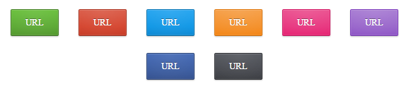
Buton resim örnekleri.
Bunlardan herhangi birisi ama terciğim budur arkadaşlar yardımcı olursanız sevirinim.
[demo]URL[/demo]
yazdığımda buton çıkacak butonun üzerinde DEMO yazacak ve eklemiş olduğum url gidecek ve diğeride şudur.
[indir]URL[/indir]
yaptığımdada DEMO yazan yer yerine İNDİR yazacak nasıl yapabilirim şöyle bir buton kodları buldum yardımcı olurmusunuz rica etsem.
Kod:
.button {

 position: relative;

 display: inline-block;

 vertical-align: top;

 height: 36px;

 line-height: 35px;

 padding: 0 20px;

 font-size: 13px;

 color: white;

 text-align: center;

 text-decoration: none;

 text-shadow: 0 -1px rgba(0, 0, 0, 0.4);

 background-clip: padding-box;

 border: 1px solid;

 border-radius: 2px;

 cursor: pointer;

 -webkit-box-shadow: inset 0 1px rgba(255, 255, 255, 0.1), inset 0 0 0 1px rgba(255, 255, 255, 0.08), 0 1px 2px rgba(0, 0, 0, 0.25);

 box-shadow: inset 0 1px rgba(255, 255, 255, 0.1), inset 0 0 0 1px rgba(255, 255, 255, 0.08), 0 1px 2px rgba(0, 0, 0, 0.25);

}

.button:before {

 content: '';

 position: absolute;

 top: 0;

 bottom: 0;

 left: 0;

 right: 0;

 pointer-events: none;

 background-image: -webkit-radial-gradient(center top, farthest-corner, rgba(255, 255, 255, 0.08), rgba(255, 255, 255, 0));

 background-image: -moz-radial-gradient(center top, farthest-corner, rgba(255, 255, 255, 0.08), rgba(255, 255, 255, 0));

 background-image: -o-radial-gradient(center top, farthest-corner, rgba(255, 255, 255, 0.08), rgba(255, 255, 255, 0));

 background-image: radial-gradient(center top, farthest-corner, rgba(255, 255, 255, 0.08), rgba(255, 255, 255, 0));

}

.button:hover:before {

 background-image: -webkit-radial-gradient(farthest-corner, rgba(255, 255, 255, 0.18), rgba(255, 255, 255, 0.03));

 background-image: -moz-radial-gradient(farthest-corner, rgba(255, 255, 255, 0.18), rgba(255, 255, 255, 0.03));

 background-image: -o-radial-gradient(farthest-corner, rgba(255, 255, 255, 0.18), rgba(255, 255, 255, 0.03));

 background-image: radial-gradient(farthest-corner, rgba(255, 255, 255, 0.18), rgba(255, 255, 255, 0.03));

}

.button:active {

 -webkit-box-shadow: inset 0 1px 2px rgba(0, 0, 0, 0.2);

 box-shadow: inset 0 1px 2px rgba(0, 0, 0, 0.2);

}

.button:active:before {

 content: none;

}


.button-green {

 background: #5ca934;

 border-color: #478228 #478228 #3c6f22;

 background-image: -webkit-linear-gradient(top, #69c03b, #5ca934 66%, #54992f);

 background-image: -moz-linear-gradient(top, #69c03b, #5ca934 66%, #54992f);

 background-image: -o-linear-gradient(top, #69c03b, #5ca934 66%, #54992f);

 background-image: linear-gradient(to bottom, #69c03b, #5ca934 66%, #54992f);

}

.button-green:active {

 background: #5ca934;

 border-color: #3c6f22 #478228 #478228;

}


.button-red {

 background: #d5452f;

 border-color: #ae3623 #ae3623 #992f1f;

 background-image: -webkit-linear-gradient(top, #da5c48, #d5452f 66%, #c73d28);

 background-image: -moz-linear-gradient(top, #da5c48, #d5452f 66%, #c73d28);

 background-image: -o-linear-gradient(top, #da5c48, #d5452f 66%, #c73d28);

 background-image: linear-gradient(to bottom, #da5c48, #d5452f 66%, #c73d28);

}

.button-red:active {

 background: #d5452f;

 border-color: #992f1f #ae3623 #ae3623;

}


.button-blue {

 background: #1097e6;

 border-color: #0d78b6 #0d78b6 #0b689e;

 background-image: -webkit-linear-gradient(top, #25a5f0, #1097e6 66%, #0f8ad3);

 background-image: -moz-linear-gradient(top, #25a5f0, #1097e6 66%, #0f8ad3);

 background-image: -o-linear-gradient(top, #25a5f0, #1097e6 66%, #0f8ad3);

 background-image: linear-gradient(to bottom, #25a5f0, #1097e6 66%, #0f8ad3);

}

.button-blue:active {

 background: #1097e6;

 border-color: #0b689e #0d78b6 #0d78b6;

}


.button-orange {

 background: #f4902a;

 border-color: #df770c #df770c #c76a0a;

 background-image: -webkit-linear-gradient(top, #f69f47, #f4902a 66%, #f38617);

 background-image: -moz-linear-gradient(top, #f69f47, #f4902a 66%, #f38617);

 background-image: -o-linear-gradient(top, #f69f47, #f4902a 66%, #f38617);

 background-image: linear-gradient(to bottom, #f69f47, #f4902a 66%, #f38617);

}

.button-orange:active {

 background: #f4902a;

 border-color: #c76a0a #df770c #df770c;

}


.button-pink {

 background: #e8367f;

 border-color: #d31865 #d31865 #bc165a;

 background-image: -webkit-linear-gradient(top, #eb5190, #e8367f 66%, #e62473);

 background-image: -moz-linear-gradient(top, #eb5190, #e8367f 66%, #e62473);

 background-image: -o-linear-gradient(top, #eb5190, #e8367f 66%, #e62473);

 background-image: linear-gradient(to bottom, #eb5190, #e8367f 66%, #e62473);

}

.button-pink:active {

 background: #e8367f;

 border-color: #bc165a #d31865 #d31865;

}


.button-gray {

 background: #47494f;

 border-color: #2f3034 #2f3034 #232427;

 background-image: -webkit-linear-gradient(top, #55585f, #47494f 66%, #3d3f44);

 background-image: -moz-linear-gradient(top, #55585f, #47494f 66%, #3d3f44);

 background-image: -o-linear-gradient(top, #55585f, #47494f 66%, #3d3f44);

 background-image: linear-gradient(to bottom, #55585f, #47494f 66%, #3d3f44);

}

.button-gray:active {

 background: #47494f;

 border-color: #232427 #2f3034 #2f3034;

}


.button-darkblue {

 background: #3b5ca0;

 border-color: #2d477b #2d477b #263c68;

 background-image: -webkit-linear-gradient(top, #4369b6, #3b5ca0 66%, #365391);

 background-image: -moz-linear-gradient(top, #4369b6, #3b5ca0 66%, #365391);

 background-image: -o-linear-gradient(top, #4369b6, #3b5ca0 66%, #365391);

 background-image: linear-gradient(to bottom, #4369b6, #3b5ca0 66%, #365391);

}

.button-darkblue:active {

 background: #3b5ca0;

 border-color: #263c68 #2d477b #2d477b;

}


.button-purple {

 background: #9966cb;

 border-color: #8040be #8040be #733aab;

 background-image: -webkit-linear-gradient(top, #a87dd3, #9966cb 66%, #8f57c6);

 background-image: -moz-linear-gradient(top, #a87dd3, #9966cb 66%, #8f57c6);

 background-image: -o-linear-gradient(top, #a87dd3, #9966cb 66%, #8f57c6);

 background-image: linear-gradient(to bottom, #a87dd3, #9966cb 66%, #8f57c6);

}

.button-purple:active {

 background: #9966cb;

 border-color: #733aab #8040be #8040be;
HTML kodları
Kod:
<a href="#" class="button button-green">URL</a>

 <a href="#" class="button button-red">URL</a>

 <a href="#" class="button button-blue">URL</a>

 <a href="#" class="button button-orange">URL</a>

 <a href="#" class="button button-pink">URL</a>

 <a href="#" class="button button-purple">URL</a>

 <a href="#" class="button button-darkblue">URL</a>

<a href="#" class="button button-gray">URL</a>Bunlardan herhangi birisi ama terciğim budur arkadaşlar yardımcı olursanız sevirinim.
Kod:
<a href="#" class="button button-blue">URL</a>